Theme management
Colors
The UI package offers theme management with a main theme. It's important to use this theme when creating components, to standardize the application's design and make it easy to modify the theme.
To use this theme, simply use the useThemeColor hook. This hook provides access to the colors attribute of the active theme, so that changes can be made immediately when the user changes theme.
const HelloWorldButton = () => {
  const Colors = useThemeColor();

  return (
    <Button
      title="Hello World"
      color={Colors.primaryColor}
      onPress={() => console.log('Hello World')}
    />
  );
};
Each theme must follow the following structure:
export interface Color {
  background_light: string;
  foreground: string;
  background: string;
}

export interface ThemeColors {
  screenBackgroundColor: string;
  backgroundColor: string;
  primaryColor: Color;
  secondaryColor: Color;
  secondaryColor_dark: Color;
  errorColor: Color;
  cautionColor: Color;
  plannedColor: Color;
  progressColor: Color;
  priorityColor: Color;
  defaultColor: Color;
  importantColor: Color;
  successColor: Color;
  warningColor: Color;
  inverseColor: Color;
  infoColor: Color;
  text: string;
  placeholderTextColor: string;
}

export interface Theme {
  key: string;
  name: string;
  colors: ThemeColors;
}

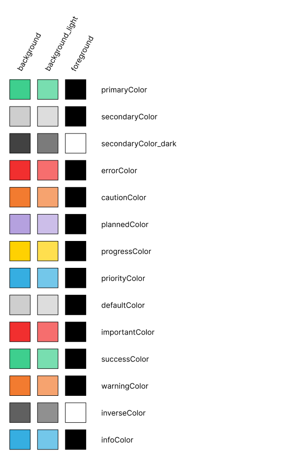
Main theme of the application
With the exception of default colors for writing and application background colors, all colors are composed of three attributes:
- background: this color must correspond to the object's main color.
- background_light: this is the main color with a lower opacity (70%), making it more discreet and easier to read.
- foreground: this color must be used for any element positioned above the background or background_light colors. It has been calculated to optimize contrast with the background color and thus optimize reading.
It is also possible to customize the application by adding other themes and/or redefining the default theme via the themes (Theme[]) and defaultTheme (Theme) attributes of the Application component.
Writing
There's a similar system for writing styles to simplify code.
-
It is therefore possible to create writing themes.
-
The active theme is accessed via the
useWritingStylehook. There's also a useWritingType hook, which returns the value of the active theme in relation to the key supplied as an argument ('title' | 'subtitle' | 'important' | 'details' | undefined). -
The structure of the themes is as follows:
export interface Writing {
  key: string;
  name: string;
  style: WritingStyles;
}

export interface WritingStyles {
  defaultSize: number;
  title: TextStyle;
  subTitle: TextStyle;
  textImportant: TextStyle;
  textDetails: TextStyle;
}

export interface TextStyle {
  fontSize?: number;
  fontWeight?: 'normal' | 'bold';
  fontStyle?: 'normal' | 'italic';
} -
The application features a main theme, but it is also possible to add themes and redefine the default theme using the Application component's writingThemes (Writing[]) and defaultWritingTheme (Writing) attributes.
export const writingDefaultTheme: Writing = {
  key: 'default',
  name: 'Default',
  style: {
    defaultSize: 14,
    title: {fontSize: 16, fontWeight: 'bold', fontStyle: 'normal'},
    subTitle: {fontSize: 16, fontWeight: 'normal', fontStyle: 'normal'},
    textImportant: {fontSize: 14, fontWeight: 'bold', fontStyle: 'normal'},
    textDetails: {fontSize: 14, fontWeight: 'normal', fontStyle: 'italic'},
  },
};