Widgets
- String
- Url
- Phone
- Password
- Number
- Slider
- ColorPicker
- Rating
- Date
- Time
- DateTime
- RelativeTime
- Duration
- Boolean
- BooleanSelect
- BooleanRadio
- BooleanSwitch
- Toggle
- InlineCheckbox
- Text
- Help
- Static
- ManyToOne
- OneToOne
- OneToMany
- ManyToMany
- MasterDetail
- Expandable
- TreeGrid
- Binary
- BinaryLink
- Image
- Drawing
- Button
- Progress
- SelectProgress
- NavSelect
- SwitchSelect
- Stepper
- RadioSelect
- CheckboxSelect
- ImageSelect
- MultiSelect
- SingleSelect
- SuggestBox
- TagSelect
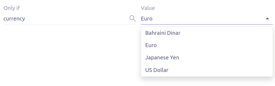
- RefSelect
- RefLink
- ImageLink
- EvalRefSelect
- RefText
- CodeEditor
- HTML
- InfoButton
- Extra Attributes
- Expressions
The Axelor Open Platform web application provides some built-in widgets. These widgets are used to represent data in form view.
All the widgets represents a domain object field and can override all the properties (min, max, required, readonly etc.) of underlying fields.
Following widgets have been implemented:
String
The string widget represents the string data type. It’s used for simple string
fields.
<field name="code"/>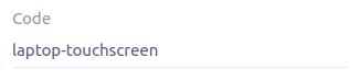
This widget can be used for string fields to enter email address. The input value will be validated to ensure user
provides a valid email id. Clicking on the icon opens your default email client with the destination email pre-filled.
<field name="email" widget="email" />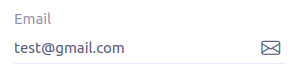
Url
This widget can be used for string fields to enter url value. The input value will be validated to ensure user
provides a valid url. Clicking on the icon opens the url on a new tab.
<field name="url" widget="url" />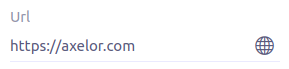
Phone
The phone widget can be used for string fields to enter and formats phone numbers.
It renders the field as a phone number link in readonly mode, and as a phone number input with a country/region selector in edit mode.
The default country is locale aware and is based on user language. If user language doesn’t contain country code,
a matching country is searched in user’s browser locales. In case of no country match in browser locales, there is some fallback behavior. For example, if user language is fr, and browser locales are fr, fr-CA, en, en-US, then country would be ca. if user language is ja, country would fallback to jp.
<field name="phone" widget="phone" />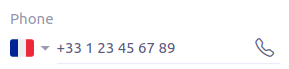
The following attributes are supported:
-
x-placeholder-number-type: country-dependent number type to use for the placeholder:FIXED_LINE(default) orMOBILE -
x-initial-country: initial country selection by specifying its two-letter country code (defaults to user/browser locale) -
x-preferred-countries: countries to appear at the top of the list (comma-separated list of two-letter country codes) (defaults to user/browser locales) -
x-only-countries: in the country dropdown, only display the specified countries (comma-separated list of two-letter country codes)
Password
This widget can be used for string fields to securely enter password values. It replaces each character with a dot symbol
unless you click on the eye icon which toggles field input visibility.
<field name="password" widget="password" />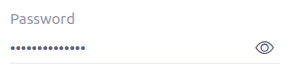
Number
The number widget is used for integer and decimal data fields.
<field name="integer" widget="Integer"/>
<field name="price" widget="Decimal" x-scale="2" x-precision="18"/>
<field name="decimal" widget="Decimal" x-scale="currency.decimalPlaces" x-precision="18"/>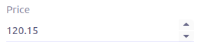
The following attributes are supported:
-
min: lowest bound of the value -
max: upper bound of the value -
x-scale: scale of the decimal value (total number of digits in decimal part). It accepts an integer for a fix scale, or a field name for a dynamic evaluation. -
x-precision: precision of the decimal value (total number of digits).
<field name="integer" widget="Integer"/>
<field name="decimal" widget="Decimal" x-scale="2" x-precision="18"/>
<field name="decimal" widget="Decimal" x-scale="currency.decimalPlaces" x-precision="18"/>
Slider
The Slider widget works on integer and decimal fields. It provides the ability to select a value within a range.
<field name="price" widget="Slider" x-step="10" />
<field name="price" widget="Slider" min="1" max="10" x-scale="currency.decimalPlaces" x-slider-show-min-max="true" />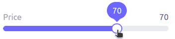
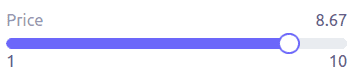
The following attributes are supported:
-
x-step: slider’s step value. Default to1forintegerfields type and to scale value fordecimalfields type. -
x-slider-show-min-max: display min and max values below slider. Default tofalse.
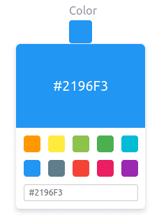
ColorPicker
The color picker widget is used for string data fields. It provides the ability to pick a color in a popper.
The value is stored in hexadecimal.
<field name="color" widget="ColorPicker"/>
<field name="color" widget="ColorPicker" x-lite="true"/>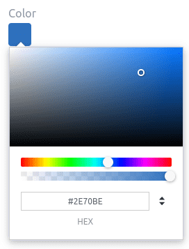
|
|
The following attributes are supported:
-
x-lite: change color picker popper to a basic palette. Default tofalse. -
x-color-picker-show-alpha: whether to accept color with alpha (ie, opacity). Not supported withx-liteattribute. Default totrue.
By default, it returns hex code format #RRGGBB. When alpha is enabled, it returns hex code format #RRGGBBAA, where
alpha is A.
Rating
The rating widget is used for integer/long/decimal data fields. It provides ability to collect measurable
opinions/experiences/feedbacks/…
By default, star icon will be colored in yellow when checked and heart in pink. The record value of the first icon
is 1, the last is the one defined in max attribute. By clicking on the last checked icon, it reset the value to 0.
Widget support partial rating on decimal fields but only for display purpose (for example, an average).
<field name="fidelity" type="Integer" widget="Rating"/>
<field name="myRating" type="Integer" widget="Rating" x-rating-icon="heart"/>
<field name="myRating" type="Integer" widget="Rating" max="8" x-rating-icon="airplane"/>
<field name="myRating" type="Integer" widget="Rating" x-rating-icon="1-square,2-square,3-square,4-square,5-square"/>
<field name="satisfaction" type="Integer" widget="Rating" x-rating-icon="emoji-angry,emoji-frown,emoji-neutral,emoji-smile,emoji-laughing" x-rating-color="#d32f2f,#d32f2f,#ed6c02,#2e7d32,#2e7d32" x-rating-highlight-selected="true" x-rating-fill="false"/>
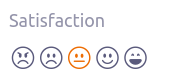
The following attributes are supported:
-
max: the number of icon to display. Default to5. -
x-rating-icon: Bootstrap icon to use. It also supports comma-separated list of icons. Default tostar. -
x-rating-color: color to use when checked. It also supports comma-separated list of colors. -
x-rating-fill: whether the icon should use fill style when checked. Defaults totrue. -
x-rating-highlight-selected: whether to highlight only the selected icon. Defaults tofalse.
Date
The date widget is used for Date data fields. Clicking on the icon opens a calendar popper to select a date easily in edit mode.
<field name="date" widget="Date" />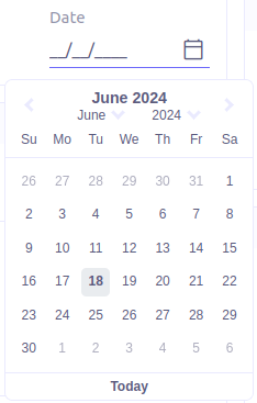
Time
The time widget is used for Time data fields.
<field name="time" widget="Time" />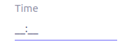
The following attribute is supported:
-
x-seconds: Show seconds. Default to false.
DateTime
The date time widget is used for DateTime data fields.
The field is rendered as a Date widget but also accepts hours and minutes.
<field name="dateTime" widget="DateTime" />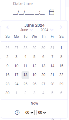
The following attribute is supported:
-
x-seconds: Show seconds. Default to false.
RelativeTime
The relative time widget is used for Date and DateTime data fields. The field renders relative time from now.
<field name="updatedOn" widget="RelativeTime" />
On a datetime field type, here is the output depending on the range :
| Range | Sample Output |
|---|---|
0 to 44 seconds |
|
45 to 89 seconds |
|
90 seconds to 44 minutes |
|
45 to 89 minutes |
|
90 minutes to 21 hours |
|
22 to 35 hours |
|
36 hours to 25 days |
|
26 to 45 days |
|
46 days to 10 months |
|
11 months to 17months |
|
18 months+ |
|
On a date field type, it will handle special cases depending on following conditions :
-
if date is today :
Today -
if date is tomorrow :
Tomorrow -
if date is yesterday :
Yesterday -
if date is within next week :
Monday … Sunday(name of the day of the week) -
if date is within last week :
Last Monday … Sunday(name of the day of the week)
Duration
The duration widget is used for integer/long data fields.
<field name="duration" widget="Duration" />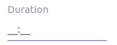
The following attributes are supported:
-
x-big: If expected duration is more than 100 hours. Default to false. -
x-seconds: Show seconds. Default to false.

BooleanSelect
The widget is used for boolean data fields. The field is rendered as a combo box with yes/no selection.
<field name="booleanSelect" widget="BooleanSelect" />
<field name="booleanSelect" widget="BooleanSelect" x-true-text="On" x-false-text="Off" />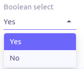
The following attributes are supported:
-
x-true-text: Change true text. Default to "Yes". -
x-false-text: Change false text. Default to "No".
BooleanRadio
The widget is used for boolean data fields. The field is rendered as a group of two radio boxes with
yes/no text.
<field name="booleanRadio" widget="boolean-radio" />
<field name="booleanRadio" widget="boolean-radio" x-true-text="On" x-false-text="Off" />
The following attributes are supported:
-
x-true-text: Change true text. Default to "Yes". -
x-false-text: Change false text. Default to "No". -
x-direction: If value is "vertical", renders the radio list vertically. Default to horizontal.
BooleanSwitch
The widget is used for boolean data fields. The field is rendered as a switching selector.
<field name="booleanSwitch" widget="boolean-switch" />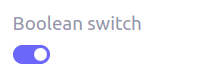
Toggle
The widget is used for boolean data fields. The field is rendered as a two state toggle button.
By default, the toggle button icon is a square for unchecked state and square-fill for checked state.
<field name="confirmed" widget="toggle" />
<field name="confirmed" type="Boolean" widget="Toggle" x-icon="star" x-icon-active="star-fill"/>

The following attributes are supported:
-
x-icon: specify an icon for unchecked state -
x-icon-hover: specify an icon for hover state -
x-icon-active: specify an icon for checked state
InlineCheckbox
The widget is used for boolean data fields. The field is rendered as default boolean widget but with
the title on right.
<field name="inlineCheckbox" widget="InlineCheckbox" />
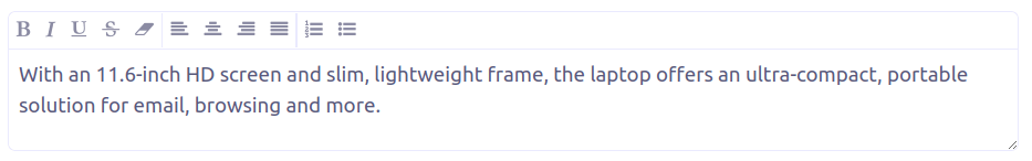
Text
The text widget is used for multiline or large string data fields.
<field name="description" widget="Text"/>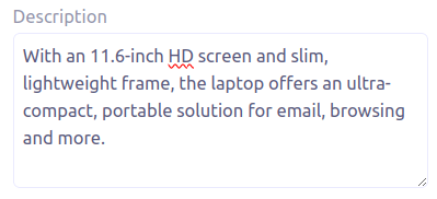
The following attribute is supported:
-
height: specify the visible height of the text area, in lines. Default to 5.
Help
This widget is used to show static help information in form view.
<help>
<![CDATA[
Some help text goes here....
]]>
</help>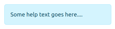
Static
This widget is similar to help widget but doesn’t apply any specific style
<static>
<![CDATA[
Some static text goes here....
]]>
</static>
ManyToOne
The widget is used for many-to-one fields.
<field name="customer" /> <!-- assuming it's m2o field -->
<field name="some" x-type="many-to-one"
  x-target="com.axelor.contact.db.Contact"
  x-target-name="fullName" /> <!-- dummy m2o field -->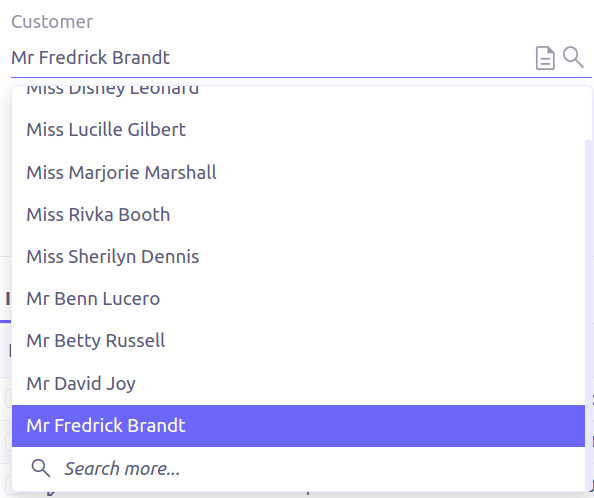
The viewer and editor for this field refers to the linked record.
<field name="contact">
  <viewer>
  <![CDATA[
    <>
      <strong>{fullName}</strong>
    </>
  ]]>
  </viewer>
  <editor>
    <field name="firstName" />
    <field name="lastName" />
  </editor>
</field>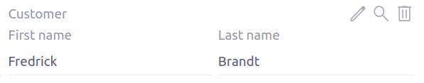
OneToMany
The widget is used for one-to-many fields.
<panel-related field="items" /> <!-- assuming it's o2m field -->
<panel-related field="some" x-type="one-to-many"
  x-target="com.axelor.sale.db.OrderItem" /> <!-- dummy o2m field -->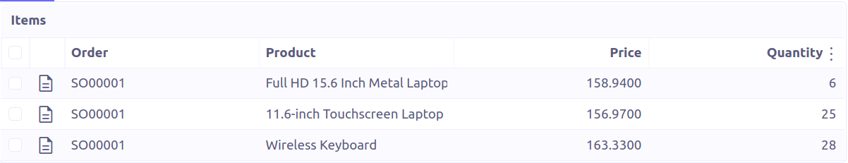
The default widget uses a grid widget to show linked records. You can specify field names to show in the list:
<panel-related field="items">
  <field name="product" />
  <field name="quantity" />
  <field name="price" />
  <field name="taxes" />
</panel-related>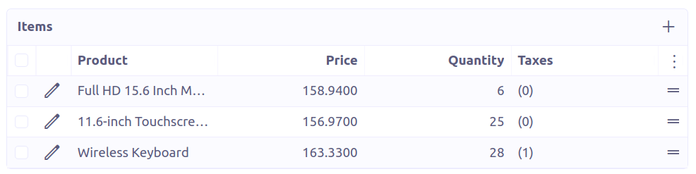
You can also display the values as repeated viewer or editor using normal
field widget:
<field name="addresses" colSpan="12">
  <viewer><![CDATA[
  <>
    <Box>{street} {area}</Box>
    <Box>{city}, {state} - {zip}</Box>
    <Box>{country.name}</Box>
  </>
]]></viewer>
  <editor x-show-titles="false">
    <field name="street" colSpan="12" />
    <field name="area" colSpan="12" />
    <field name="city" colSpan="4" />
    <field name="state" colSpan="4" />
    <field name="zip" colSpan="4" />
    <field name="country" colSpan="12" widget="SuggestBox" />
  </editor>
</field>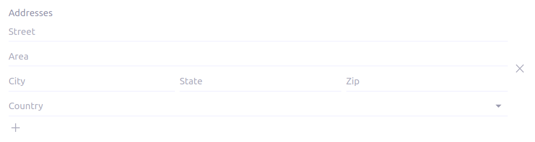
ManyToMany
The widget is used for many-to-many fields. This is same widget as one-to-many
but one additional icon to select existing records.
MasterDetail
This widget is supported on one-to-many and many-to-many fields. It allows to show a form view below the grid view for the currently selected row.
<panel-related
  field="items"
  readonlyIf="confirmed"
  editable="true"
  orderBy="sequence"
  onChange="com.axelor.sale.web.SaleOrderController:calculate"
  widget="MasterDetail"
>
  <field name="product" onChange="action-order-line-change-product" />
  <field name="price" />
  <field name="quantity" />
  <field name="taxes" />
</panel-related>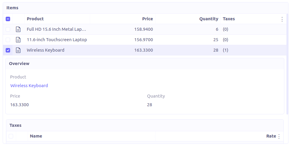
The following attribute is supported:
-
summary-view: (optional) used to define the form view shown below the grid view. If not specified, the view specified byform-viewattribute is used instead.
| If grid is editable, summary form view stays readonly. |
Expandable
This widget is supported on one-to-many fields and top-level grids. It allows to show an expandable form view below each row.
<panel-related
  field="items"
  readonlyIf="confirmed"
  editable="true"
  orderBy="sequence"
  onChange="com.axelor.sale.web.SaleOrderController:calculate"
  widget="Expandable"
>
  <field name="product" onChange="action-order-line-change-product"/>
  <field name="price"/>
  <field name="quantity"/>
  <field name="taxes"/>
</panel-related>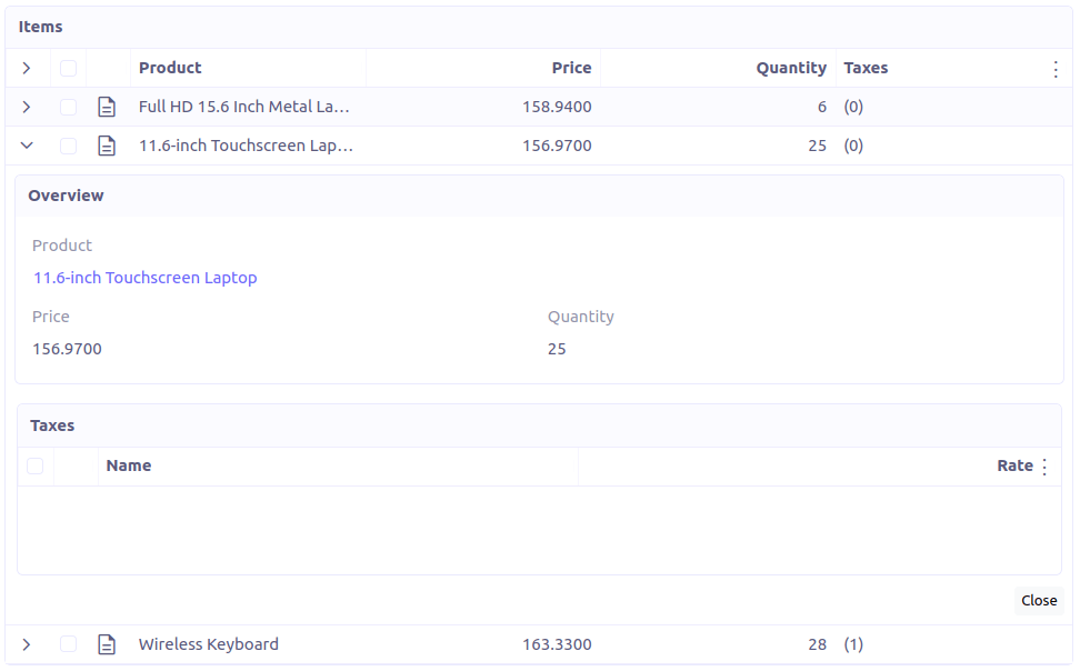
The following attributes are supported:
-
summary-view: (optional) used to define the expandable form view. If not specified, the view specified byform-viewattribute is used instead. -
x-expand-all: (optional) to enable expand all feature, you have to specify a comma-separated list of nested expandable collection fields, if any. Supported on form field only, not on top-level grid.
TreeGrid
This widget is supported on one-to-many fields. It allows to show a tree-like structure in a grid view.
With editable="true" (inline edit), when you edit a row at any nesting level, you can press Ctrl+Enter to add a subitem.
<panel-related
  title="Items (Tree)"
  readonlyIf="confirmed"
  field="items"
  form-view="order-line-form"
  grid-view="order-line-grid"
  editable="true"
  onChange="com.axelor.sale.web.SaleOrderController:computeItems"
  widget="TreeGrid"
  x-tree-field="items"
  x-tree-limit="2"
  x-tree-field-title="Add subline"
>
  <field name="product" onChange="action-order-line-change-product"/>
  <field name="price" width="200" />
  <field name="quantity" width="150" />
</panel-related>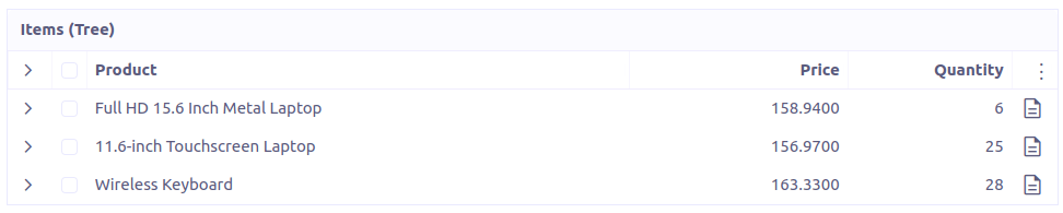
The following attributes are supported:
-
x-tree-field: (optional) used to define the nested o2m field, defaults to panel-related/field name. -
x-tree-limit: (optional) used to specify limit to support nested tree structure. -
x-tree-field-title: (optional) title used for add subitem button, defaults to "Add subitem" (button is shown only when item contains no subitems). -
x-expand-all: (optional) it’s enabled by default with tree-grid, it usesx-tree-fieldvalue asx-expand-allvalue. To disable it, we can set it to"false" -
summary-view: (optional) used to define the extended form view, which will be displayed along with sub-lines view.
Only onChange action on root collection is performed. Actions defined on sub-items are not supported.
|
Binary
The binary widget is file upload widget used with binary fields.
<field name="file" widget="binary" />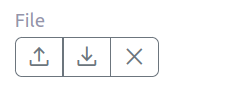
The following attribute is supported:
-
x-accept: Specify the file types the file input should accept. Can be a filename extension or a MIME type (see MDN doc)
BinaryLink
This widget can be used with many-to-one fields referencing com.axelor.meta.db.MetaFile records. It allows
single click download and upload.
<field name="metaFile" widget="binary-link" />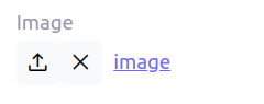
The following attribute is supported:
-
x-accept: Specify the file types the file input should accept. Can be a filename extension or a MIME type (see MDN doc)
Image
The image widget is used with binary fields that stores image data or
many-to-one fields referencing com.axelor.meta.db.MetaFile records.
<field name="picture" widget="image" />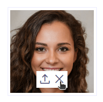
The following attribute is supported:
-
x-accept: Specify the file types the file input should accept. Can be a filename extension or a MIME type (see MDN doc)
Drawing
The drawing widget is used to freely draw on a pop-up canvas.
It uses binary fields that stores image data or many-to-one
fields referencing com.axelor.meta.db.MetaFile records.
<field name="signature" widget="drawing" />
<field name="signature" widget="drawing" x-stroke-width="2" x-stroke-color="red" />
<field name="signature" widget="drawing" x-stroke-width="1.5" x-stroke-color="aqua" x-drawing-height="800" x-drawing-width="700" />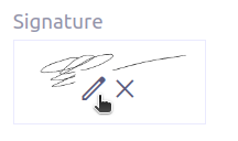
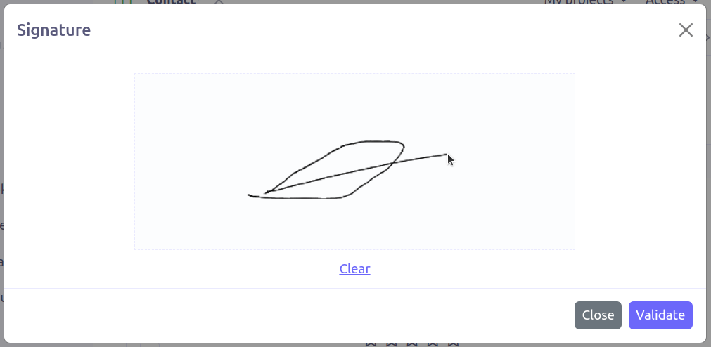
The following attributes are supported:
-
x-stroke-width: The stroke width. Default to 0.5. -
x-stroke-color: The stroke color. Can be any color name. Default to black. -
x-drawing-height: The drawing height in px. Default to 200. -
x-drawing-width: The drawing width in px. Default to 500.
Button
The button widget is used to show a clickable button on a form.
<button name="customBtn" title="Click Me!" onClick="actions"
  prompt="This is a confirmation message."
  icon="check-square" />
<button name="customBtn" title="Button" link="https://axelor.com" />

The following attributes are supported:
-
onClick: action to execute on click event -
prompt: confirmation message before performing client action -
link: If specified then the button is rendered as a link. Use empty value if you only need a link effect and perform actual action with onClick. -
icon: button icon (an image or an icon) -
iconHover: button icon on mouse hover (an image or an icon)
Progress
The Progress widget is used to show a progress bar.
<field name="progress" title="Progress" widget="Progress"
  x-colors="r:24,y:49,b:74,g:100" />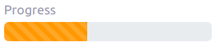
Progress widget supports following attributes:
-
min: number value to specify minimum range for progress (default to0) -
max: number value to specify maximum range for progress (default to100) -
x-colors: color options to configure the bar color (default tor:24,y:49,b:74,g:100)
Using the x-colors options, you can configure the bar color. Four colors can be configured. With r:24,y:49,b:74,g:100,
following colors will be used depending on the percentage value :
-
red (r) - if percentage value in range [0, 24]
-
yellow (y) - if percentage value in range [25, 49]
-
blue (b) - if percentage value in range [50, 74]
-
green (g) - if percentage value in range [75, 100]
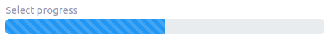
SelectProgress
Similar to the Progress widget, the SelectProgress widget can be used with a selection field to show selection in
editable mode and for readonly mode it will display as progress widget.
<selection name="select.progress.selection">
  <option value="0">None</option>
  <option value="50">Half</option>
  <option value="100">Full</option>
</selection>

<field name="selectProgress" widget="SelectProgress" selection="select.progress.selection"/>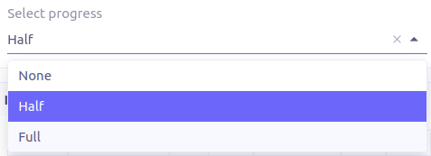
NavSelect
The NavSelect widget is a breadcrumb like widget and can be used with selection fields.
<field name="status" widget="NavSelect" />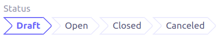
SwitchSelect
The SwitchSelect widget works on selection, enum and many-to-one fields. It is used to pick a choice from a multiple-choice list.
<field name="status" widget="SwitchSelect" x-direction="vertical" />
<field name="businessSector" widget="SwitchSelect" />
<field name="businessSector" widget="SwitchSelect" x-labels="false" />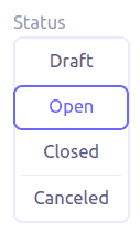
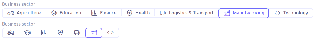
The following attributes are supported:
-
x-labels: Whether to display labels. Default totrue. -
x-direction: If value is "vertical", renders the list vertically. Default to horizontal.
Stepper
The Stepper widget works on selection, enum and many-to-one fields. It is used to indicate progress
through a multi-step process.
<field name="status" widget="Stepper" />
<field name="stepper" widget="Stepper" x-stepper-show-description="true" x-stepper-type="icon" x-stepper-completed="false" selection="stepper.process.selection"/>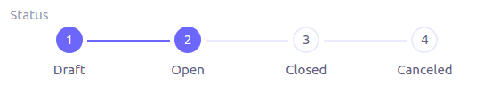
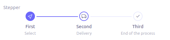
The following attributes are supported:
-
x-stepper-show-description: If true, display description below label. Not supported on reference fields. Default tofalse. -
x-stepper-type: If value is "icon", display icon instead of numeric indicator. Not supported on reference fields. Default tonumeric. -
x-stepper-completed: If true, the current step indicator is fully colored instead of having a simple border. Default totrue.
RadioSelect
The RadioSelect widget can be used with selection fields. The field is rendered
as radio selection list.
<field name="status" widget="RadioSelect" />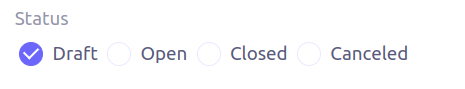
The following attribute is supported:
-
x-direction: If value is "vertical", renders the radio list vertically. Default to horizontal.
CheckboxSelect
The CheckboxSelect is same as RadioSelect but uses checkbox list.
<field name="status" widget="CheckboxSelect" />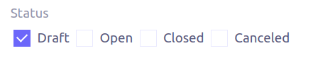
The following attribute is supported:
-
x-direction: If value is "vertical", renders the checkbox list vertically. Default to horizontal.
ImageSelect
The ImageSelect widget can be used with a selection field where selection icon is either
image urls or font icons. If no icon is provided, it uses the value as icon.
x-labels attribute can be provided to show or not the selection text (default to true).
<field name="IconSelect" selection="my.social.network.selection" widget="ImageSelect" title="Social network"/>

<selection name="my.social.network.selection">
   <option value="1" icon="discord">Discord</option>
   <option value="2" icon="facebook">Facebook</option>
   <option value="3" icon="instagram">Instagram</option>
   <option value="4" icon="linkedin">Linkedin</option>
   <option value="5" icon="twitter-x">X</option>
</selection>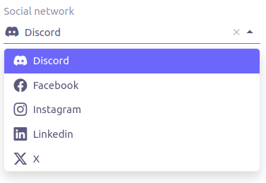
MultiSelect
The MultiSelect widget can be used with a selection field to select multiple values displayed as tags. Tag colors can be defined in the selection options via the color attribute.
<selection name="product.color.selection">
  <option value="black" color="black ">Black</option>
  <option value="white" color="white">White</option>
  <option value="gray" color="grey">Gray</option>
  <option value="red" color="red">Red</option>
  <option value="green" color="green">Green</option>
  <option value="blue" color="blue">Blue</option>
  <option value="yellow" color="yellow">Yellow</option>
  <option value="chocolate" color="brown">Brown</option>
  <option value="orange" color="orange">Orange</option>
  <option value="purple" color="purple">Purple</option>
  <option value="pink" color="pink">Pink</option>
</selection>

<field name="colorVariants" widget="MultiSelect" selection="product.color.selection" />
The following attribute is supported:
-
x-selection-show-checkbox: Show checkbox. Default to false.
SingleSelect
The SingleSelect widget can be used with a selection field to select a single value displayed as a tag. Tag colors can be defined in the selection options via the color attribute.
<selection name="order.status.selection">
  <option value="DRAFT" color="blue">Draft</option>
  <option value="OPEN" color="yellow">Open</option>
  <option value="CANCELED" color="red">Canceled</option>
  <option value="CLOSED" color="green">Closed</option>
</selection>

<field name="orderStatus" widget="SingleSelect" selection="order.status.selection"/>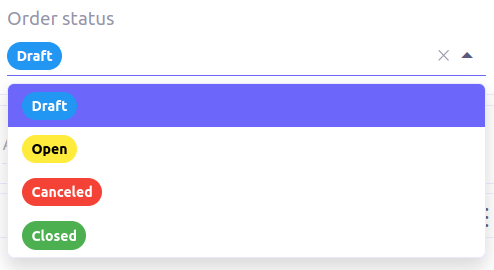
SuggestBox
The SuggestBox widget can be used with a many-to-one or one-to-one field to show suggestion list of matching records (similar to selection fields).
<field name="title" widget="SuggestBox"/>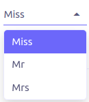
TagSelect
The TagSelect widget can be used with a many-to-many field to select multiple values displayed as tags.
<field name="circles" widget="TagSelect"/>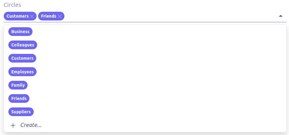
The following attributes are supported:
-
x-color-field: specify the tag color field that should either use selectioncolor.name.selection. From version 7.2.1, it also accepts a hexadecimal value. -
x-image-field: specify the image field to use.
Available tag color values for MultiSelect, SingleSelect, and TagSelect:
<selection name="color.name.selection">
<option value="red" color="red">Red</option>
<option value="pink" color="pink">Pink</option>
<option value="purple" color="purple">Purple</option>
<option value="deeppurple" color="deeppurple">Deep Purple</option>
<option value="indigo" color="indigo">Indigo</option>
<option value="blue" color="blue">Blue</option>
<option value="lightblue" color="lightblue">Light Blue</option>
<option value="cyan" color="cyan">Cyan</option>
<option value="teal" color="teal">Teal</option>
<option value="green" color="green">Green</option>
<option value="lightgreen" color="lightgreen">Light Green</option>
<option value="lime" color="lime">Lime</option>
<option value="yellow" color="yellow">Yellow</option>
<option value="amber" color="amber">Amber</option>
<option value="orange" color="orange">Orange</option>
<option value="deeporange" color="deeporange">Deep Orange</option>
<option value="brown" color="brown">Brown</option>
<option value="grey" color="grey">Grey</option>
<option value="bluegrey" color="bluegrey">Blue Grey</option>
<option value="black" color="black">Black</option>
<option value="white" color="white">White</option>
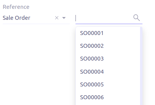
</selection>RefSelect
Sometimes we need to reference a record from different types. For example,
in an Email, we may have to give reference to an Invoice or SaleOrder or
even a Contact. The standard ManyToOne field can’t work here as it can
only refer single type.
The RefSelect widget can be used in such cases. In order to use RefSelect,
we require two fields in target object and a selection of types.
<entity ...>
  ...
  <string name="reference" /> (1)
  <integer name="referenceId" /> (2)
</entity>| 1 | - will store the reference object type name |
| 2 | - will store the reference record id |
and a selection of types:
<selection name="my.reference.select">
  <option value="com.axelor.sale.db.Order">SaleOrder</option> (1)
  <option value="com.axelor.contact.db.Contact"
    data-domain="self.email LIKE '%gmail%'"
    data-grid="my-custom-grid-view">Contact</option> (2)
</selection>| 1 | - define selection option with fully qualified type name as value |
| 2 | - you can define extra attributes using data- prefix |
and we can use the reference widget like this:
<form ...>
  ...
  <field name="reference" selection="my.reference.select" widget="RefSelect" />
</form>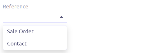
The following attribute is supported:
-
x-related: specify related field. Default to fieldName + "Id" concatenated (reference ⇒ referenceId).
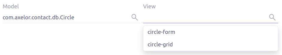
Use data-grid or data-form attributes to specify different views
|
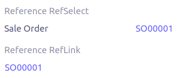
RefLink
In edit mode, this widget is the same as RefSelect. But in readonly mode, it only displays the link to the record (the type is not displayed).
Example usage from TeamTask:
<field name="relatedModel"
  title="Link"
  widget="RefLink"
  selection="team.task.links"
  x-related="relatedId" />
The following attribute is supported:
-
x-related: specify related field. Default to fieldName + "Id" concatenated (reference ⇒ referenceId).
ImageLink
In edit mode, this widget is used as string field input and we can enter interpolate string value. But in readonly mode, it displayed as Image widget with src link to that input value.
<field name="imageLink" widget="ImageLink" />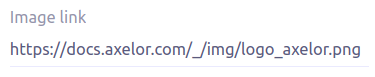
EvalRefSelect
This widget can be used to select reference value depending on dynamic target model value. The following attributes should be provided:
-
x-eval-target: expression to find target model -
x-eval-target-name: expression to find target model name field -
x-eval-value: expression to get/set reference value (id) -
x-eval-title: expression to get/set reference title (name value)
Example usage from MetaJsonField:
<field name="contextFieldValue"
  widget="eval-ref-select"
  x-eval-target="contextFieldTarget"
  x-eval-target-name="contextFieldTargetName"
  x-eval-value="contextFieldValue"
  x-eval-title="contextFieldTitle" />
RefText
This widget can be used to select string field value of a record.
-
x-target: target model -
x-target-name: target model name field -
x-target-search: optional additional field value in selection list, displayed asx-target-name(x-target-search) -
x-domain: optional domain filter on target model
Example where we select model name of meta model:
<field name="model" required="true" widget="ref-text"
  x-target="com.axelor.meta.db.MetaModel"
  x-target-name="fullName" />
Example where we select name of meta view, add module name in selection list, and use a domain filter:
<field name="view" widget="ref-text"
  x-target="com.axelor.meta.db.MetaView"
  x-target-name="name"
  x-target-search="module"
  x-domain="self.model = :model AND self.type IN ('form', 'grid')" />
CodeEditor
The CodeEditor widget is a special widget for string data fields to use a code editor to input the source code text.
<field name="script" widget="code-editor" x-code-syntax="xml"/>
The following attributes are supported:
-
x-code-syntax: syntax highlighting -
x-code-theme: theme to style the editor. If not defined, use the default theme.
As part of the new v7 front-end built on top of React, x-code-theme is no more supported. It will be
re-added in a future version.
|
HTML
The html editor widget is a special widget for string data fields to provide html text.
Html widget has a special attribute x-lite to use a compact and
little version of the widget.
<field name="note" widget="html"/>
<field name="note" widget="html" x-lite="true"/>
The following attribute is supported:
-
x-lite: Show a lighter version of the widget. Default to false.
InfoButton
This can be used on a button to dispay data bound to a record value (real or dummy).
If the name of the button is the name of a field, it is bound to that field.
Otherwise, use the x-field attribute to specify the bound field.
When using x-field, the button and the field are 2 distinct elements. Any attributes
defined on that field will be used to format the value. Moreover, this allows to change
the button attributes without impact on the bound field.
<panel>
  <button
    name="btnTotalAmount"
    title="Total amount"
    icon="bar-chart"
    onClick="check-order-dates,com.axelor.sale.web.SaleOrderController:calculate,save"
    widget="info-button"
    x-field="totalAmount"
  />
  <field name="totalAmount" hidden="true"/>
</panel>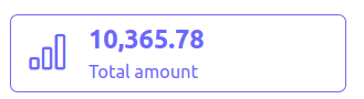
Extra Attributes
In addition to the common properties, widgets supports the following extra properties depending on the widget/type.
| Attribute | Description | Default |
|---|---|---|
|
expression to bind to the field value |
|
|
whether the field contributes to the record dirty check |
|
|
the names of required fields to be used for quick record creation from |
|
|
specify an icon |
|
|
specify an icon for hover state |
|
|
whether the boolean field used inside the o2m repeat editor should be exclusive |
|
|
comma-separated list of names of icons to show, or
|
|
|
whether to reset dummy field value on form save |
|
|
whether to allow copy of o2m/m2m field items |
|
|
action to call after duplicating record in o2m/m2m grid, used when |
|
|
action to call when deleting record in o2m/m2m grid |
|
|
layout direction (horizontal, vertical) of some widgets (e.g. |
|
|
syntax highlighting for the code editor widget |
|
|
specify the order of suggest box list |
|
|
specify the maximum number of items in suggest box list |
|
|
specify the default page limit of search popup |
|
|
precision of the decimal value (total number of digits) |
|
|
scale of the decimal value (total number of digits in decimal part). It accepts an integer for a fix scale, or a field name for a dynamic evaluation. |
|
|
specify the file types the file input should accept |
|
|
specify the image field to use with |
|
|
specify whether to open the |
Expressions
The form view widget’s states can be set using boolean expressions from the xml views.
These are:
-
showIf- show the widget -
hideIf- hide the widget -
requiredIf- mark the widget as required -
readonlyIf- mark the widget as readonly -
validIf- validate the field
The boolean expressions are evaluated against current form values. The following special variables can be used:
-
$moment(d)- a helper to convert date to moment.js object -
$number(d)- a helper to convert text to number -
$contains(list, item)- a helper to check whether list contains the item -
$readonly()- whether the widget is readonly -
$required()- whether the widget is required -
$valid([name])- whether the widget is valid -
$invalid([name])- whether the widget is invalid -
$get(path)- get the value with dotted path -
$popup()- whether the form is a popup -
$user- login of current user -
$group- group code of current user
Examples:
<field name="createDate" readonlyIf="confirmed"/>
<field name="amount" validIf="$number(amount) >= 100" />
<field name="password" validIf="password.length > 5" />
<field name="confirmPassword" validIf="password === confirmPassword" />