Studio Charts
Overview
Studio Charts allow you to create visual data representations from your application models. Charts are configurable through a form-based interface — no coding required. Studio supports 11 chart types, from standard bar and line charts to specialized gauges and funnels.
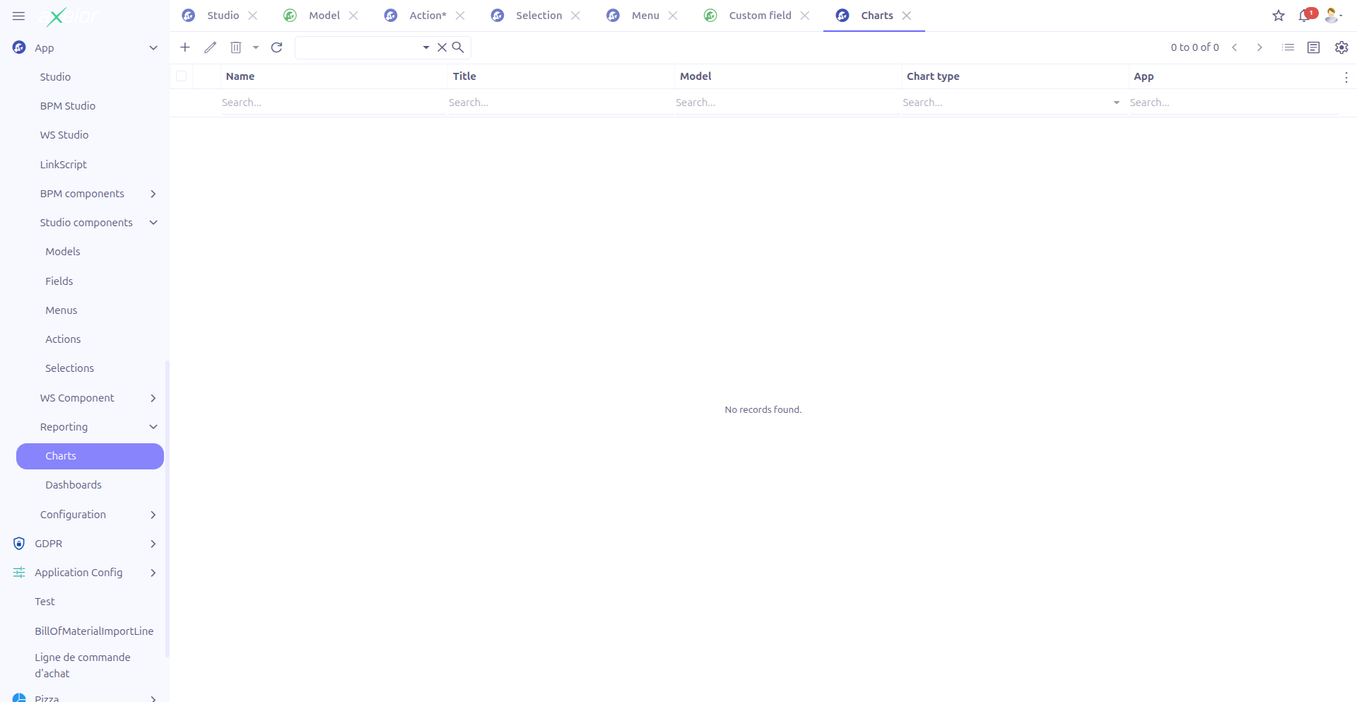
Charts are managed from App > Reporting > Charts.
Creating a Chart
Navigate to App > Reporting > Charts and click New.
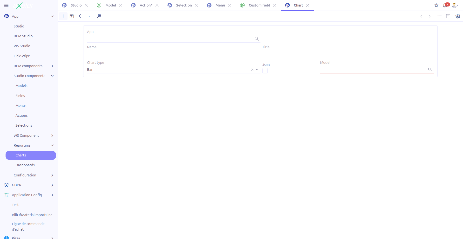
Basic Information
| Field | Required | Description |
|---|---|---|
Name (1) |
Yes |
Unique technical name of the chart. Must not contain spaces. The name is validated and normalized automatically. |
Title (2) |
Yes |
Display title shown above the chart. |
Chart type (3) |
Yes |
The visualization type. Default: |
Is JSON (4) |
No |
Toggle between custom (JSON) models and standard models. |
Model (5) |
No |
The data model to query for chart data. When using JSON models, select from |
Studio App (6) |
No |
Associates the chart with a Studio App for packaging. Only visible when |
| The aggregate, group, display, and filter panels are only visible after a model has been selected. |
Chart Types
Studio supports 11 chart types, each suited for different data visualization needs:
| Type | Description |
|---|---|
Bar |
Vertical bar chart. Best for comparing quantities across categories. |
Horizontal Bar (hbar) |
Horizontal bar chart. Useful when category labels are long. |
Line |
Line chart. Ideal for showing trends over time. |
Area |
Area chart (filled line). Emphasizes volume under the trend line. |
Pie |
Pie chart. Shows proportional distribution of a whole. |
Donut |
Donut chart (ring). Similar to pie but with a hollow center. |
Radar |
Radar/spider chart. Compares multiple variables on radial axes. |
Scatter |
Scatter plot. Shows correlation between two numeric variables. |
Gauge |
Gauge chart. Displays a single value within a range. |
Funnel |
Funnel chart. Shows progressive reduction through stages. |
Text |
Text display. Shows a computed value as formatted text. |
Data Configuration
Each chart requires three configuration dimensions: what to measure (aggregate), how to categorize (group), and what to display (display field).
Aggregate (Measure)
The aggregate defines the value computed and displayed on the chart axis.
| Field | Description |
|---|---|
Is JSON |
Toggle to select a MetaJsonField instead of a MetaField. |
Aggregate on |
The field to aggregate. Select a |
Target |
When the aggregate field is a relational field, specify the target field to aggregate on. Auto-detected based on the selected field. |
Date type |
When aggregating a date field, select the granularity: day, month, or year. Only shown for date-type fields. |
Group By (Dimension)
The group dimension defines how data is categorized along the chart axis.
| Field | Description |
|---|---|
Is JSON |
Toggle to select a MetaJsonField instead of a MetaField. |
Group on |
The field to group by. Select a |
Target |
Target field for relational group fields. Auto-detected. |
Date type |
Grouping granularity for date fields: day, month, or year. Only shown for date-type fields. |
Display Field
The display field provides an alternative label for chart data points.
| Field | Description |
|---|---|
Is JSON |
Toggle to select a MetaJsonField instead of a MetaField. |
Display field |
An optional field used for display labels instead of the group field’s raw value. |
Display type |
How the value is formatted: Value (0) shows the raw number, Percentage (1) shows the value as a percentage of the total. |
Filters
The Filters panel allows you to restrict the data included in the chart. Filters are stored as Filter entities linked to the chart.
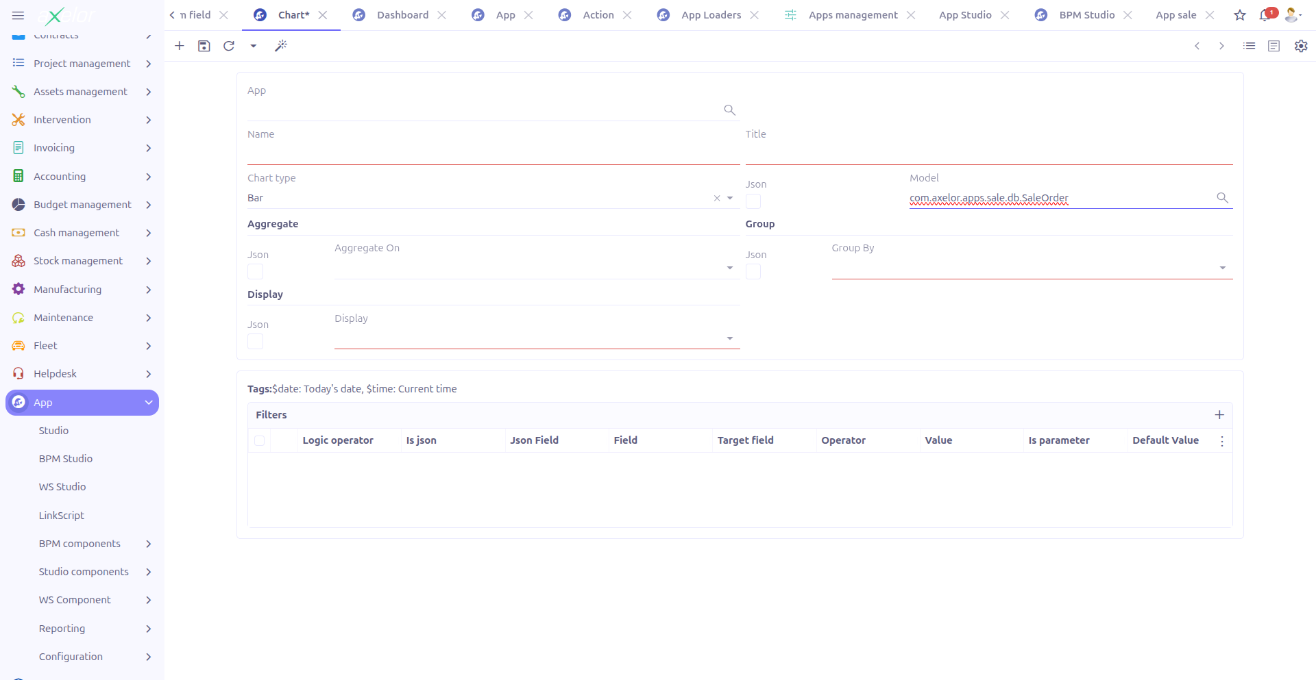
| Field | Description |
|---|---|
Is JSON |
Toggle between standard and JSON model fields. |
Target field |
The field to filter on (MetaField or MetaJsonField). |
Target type |
The data type of the target field (auto-detected). |
Operator |
Comparison operator. See Available Filter Operators below. |
Value |
The comparison value. |
Is parameter |
When checked, the filter appears as a user-configurable parameter on the chart view, allowing end users to adjust the filter at runtime. |
Logic operator |
Combine multiple filters with AND (0, default) or OR (1). |
Available Filter Operators
Studio provides 16 filter operators:
| Operator | Description |
|---|---|
|
Equals |
|
Not equals |
|
Greater than |
|
Greater than or equal |
|
Less than |
|
Less than or equal |
|
Value is in a list |
|
Value is not in a list |
|
Pattern matching (SQL LIKE) |
|
Negative pattern matching |
|
Field is null |
|
Field is not null |
|
Boolean is true |
|
Boolean is false |
|
Collection includes value |
|
Collection does not include value |
Filter Value Variables
Use these built-in variables in filter values:
-
$date— Today’s date -
$time— Current time
|
Use the Is parameter option to create interactive charts where users can adjust filter criteria at runtime. For example, add a date range parameter so users can view data for different periods. |
Example: Monthly Sales Chart
To create a bar chart showing confirmed order totals by month:
-
Create a chart with name
custom.monthly.salesand title "Monthly Sales" -
Set chart type to Bar
-
Set model to
SaleOrder -
Set Aggregate on to
exTaxTotal -
Set Group on to
orderDate -
Set Group date type to
month -
Add a filter:
statusSelectequals3(confirmed orders)
This produces a bar chart displaying the sum of exTaxTotal for each month, filtering only confirmed orders.
Technical Details
Charts are stored in the StudioChart entity (com.axelor.studio.db, cacheable). When a chart is saved, a MetaView of type chart is automatically generated and registered in the application.
Key backend services:
-
StudioChartServiceImpl— Resolves default target fields and target types for relational and date fields -
StudioChartController.viewRelatedRecord()— Handles click events on chart data points to navigate to the related records
Related Pages
-
Dashboards — Combine charts into dashboard pages
-
Studio Apps — Package charts in apps
-
Custom Models — Data sources for charts
-
Studio Overview — Complete feature overview