Selections
Overview
Selections (also called selection lists or dropdowns) define a fixed set of options that can be used by custom fields. Each option has a value, a display title, and optionally a color and an icon.
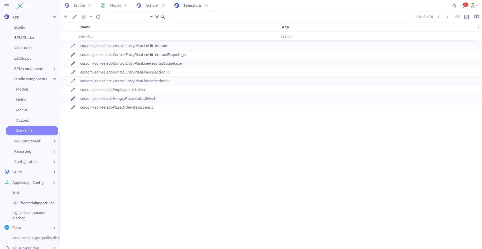
Selections are managed from App > Studio components > Selections.
Creating a Selection
Navigate to App > Studio components > Selections and click New.
Selection Fields
| Field | Required | Description |
|---|---|---|
Meta select (1) |
No |
Link to an existing |
Name (2) |
Yes |
Technical name of the selection. Editable only when no Meta select is linked. |
Studio App (3) |
No |
Associates the selection with a Studio App. |
|
To modify an existing system selection (e.g., add new options to a status dropdown), set the Meta select field to reference the existing selection. This way, your additions are tracked as Studio customizations. |
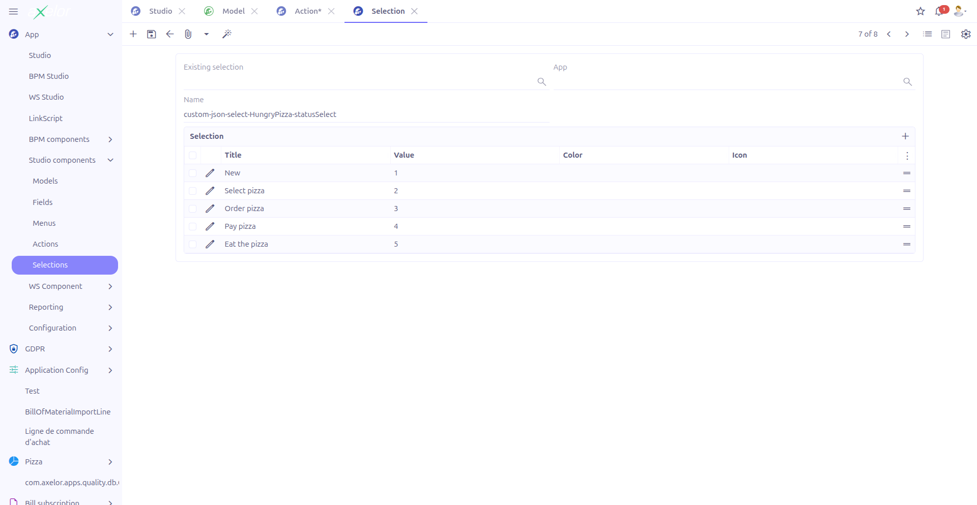
Option List
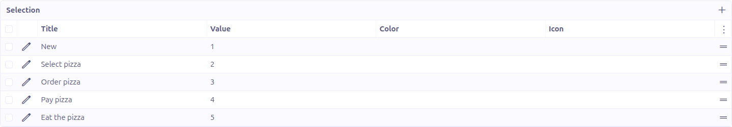
The Options panel displays the list of selection values. Each option has:
| Field | Required | Description |
|---|---|---|
Title (4) |
No |
Display text shown to the user. Supports translation. |
Value (5) |
Yes |
The stored value when this option is selected. This is the actual data saved in the database. |
Color (6) |
No |
A color applied to the option (SingleSelect from |
Icon (7) |
No |
An icon displayed next to the option text. |
Options can be reordered by dragging them (canMove is enabled). The order in the list determines the display order in the dropdown.
To add a new option, click the + button in the options panel. To remove an option, click the delete icon on the option row.
Selection Widgets
When a custom field uses a selection, the display widget can be customized. The available widget types are:
| Widget | Description |
|---|---|
Select (default) |
Standard dropdown list. User clicks to open and selects one option. |
NavSelect |
Horizontal tab-style selector. All options are visible as clickable tabs. Best for selections with few options (3-6). |
RadioSelect |
Radio button group. Each option is displayed as a radio button. Suitable for small sets of mutually exclusive options. |
CheckboxSelect |
Checkbox group. Allows selecting multiple options. Used with multi-value fields. |
MultiSelect |
Multi-select dropdown. Allows selecting multiple values from a dropdown list. |
SingleSelect |
Single-select with colored badge display. Shows the selected value as a colored tag. |
ImageSelect |
Image-based selector. Options are displayed as icons or images. |
|
The widget type is configured on the field that uses the selection, not on the selection itself. Different fields can use the same selection with different widget types. |
How It Works
Internally, the selection form uses a special mechanism for editing options:
-
When the form loads, the stored
selectionText(a serialized string) is parsed into a virtual$selectOptionListthat provides the interactive editing interface. -
When the form is saved, the option list is serialized back into
selectionTextby theStudioSelectionController.generateSelectionText()method.
This means the actual data is stored as a single text field, while the form provides a user-friendly editing interface.
Example: Creating a Priority Selection
Here is a practical example of creating a "Priority" selection for a task management custom model:
-
Navigate to App > Studio components > Selections
-
Click New
-
Set Name to
custom.task.priority.select -
Add options:
| Title | Value | Color |
|---|---|---|
Low |
1 |
green |
Medium |
2 |
orange |
High |
3 |
red |
Critical |
4 |
red |
-
Click Save
You can then use this selection on a custom field by setting the field’s Selection property to custom.task.priority.select and choosing the desired widget (e.g., NavSelect for a horizontal tab display or SingleSelect for colored badges).
Technical Details
Selections are stored in the StudioSelection entity:
| Field | Type | Description |
|---|---|---|
|
String (required) |
Technical name of the selection |
|
Large String |
Serialized option definitions |
|
M2O: MetaSelect |
Reference to existing system selection |
|
M2O: StudioApp |
Studio App grouping |
The backend services involved:
-
StudioSelectionController.fillSelectOption()— ParsesselectionTextinto the option list on form load -
StudioSelectionController.generateSelectionText()— Serializes the option list back intoselectionTexton save -
StudioSelectionController.fillSelectionText()— Fills selection text from meta select reference
Related Pages
-
Custom Fields — Using selections on fields
-
Visual View Builder — Adding selection fields via drag and drop
-
Studio Apps — Packaging selections with other components