Menus
Overview
Studio Menus allow you to create and manage navigation entries that provide access to your custom views and data. Each menu entry can point to a specific action, have an icon, and be restricted to certain user roles.
Menus are managed from App > Studio components > Menus.
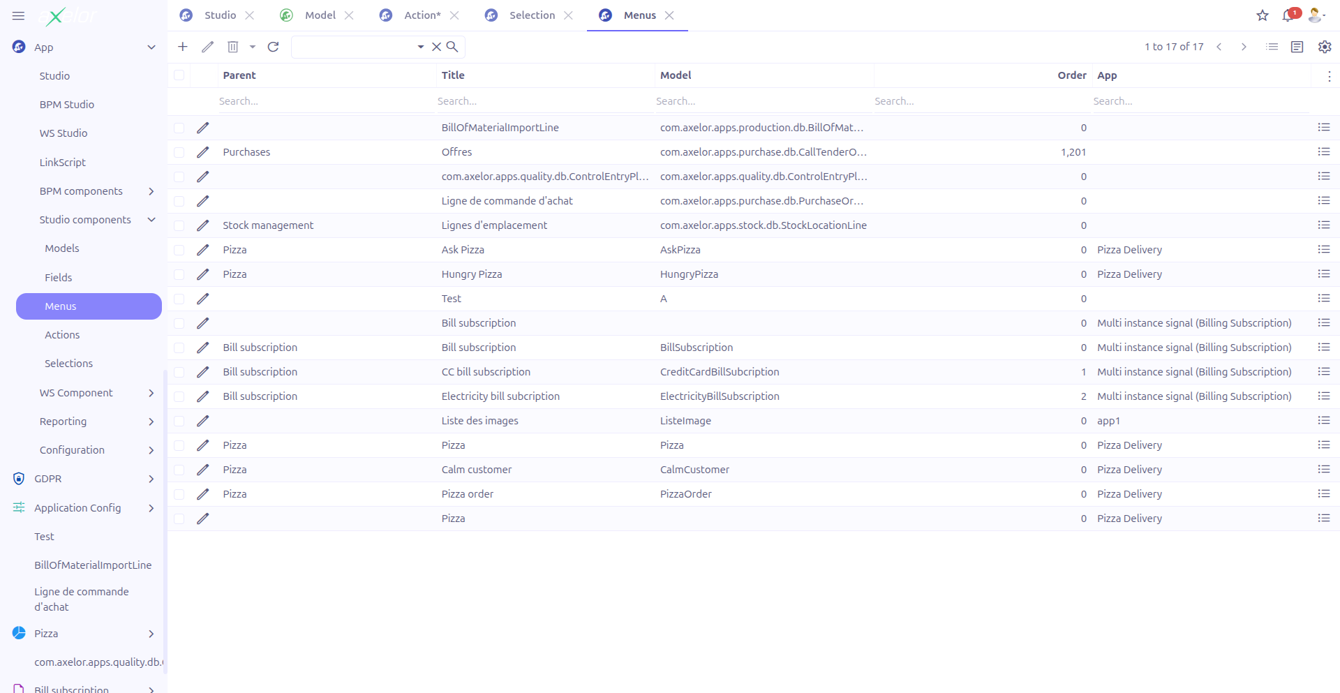
The grid view provides a Show records button that opens the records accessible through the selected menu’s action.
Creating a Menu
Navigate to App > Studio components > Menus and click New, or use the inline menu editor in the Custom Model form when enabling menu generation.
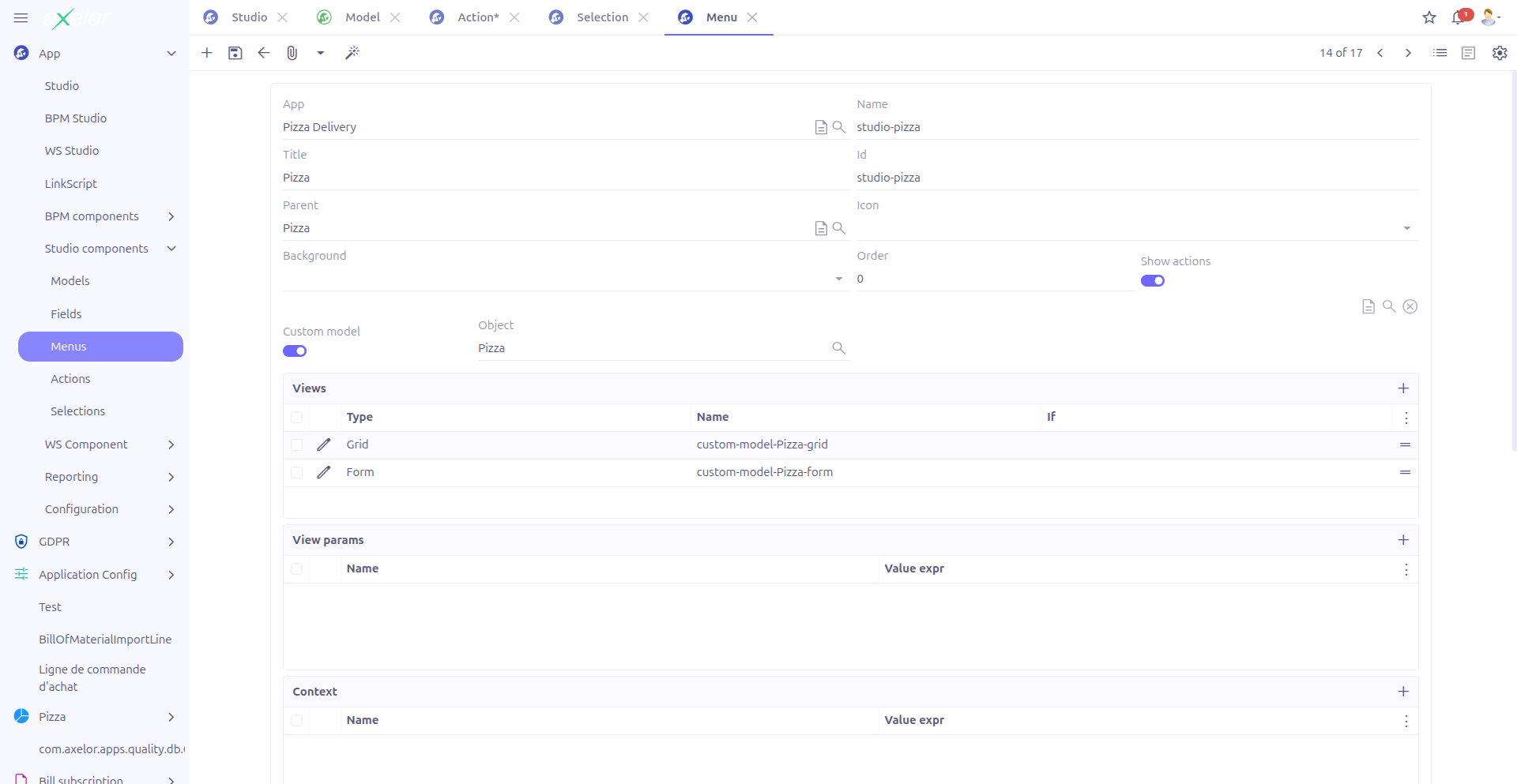
Basic Information
| Field | Required | Description |
|---|---|---|
Existing menu (1) |
No |
Virtual field (visible only on new records). Select an existing menu to modify it instead of creating a new one. |
Name (2) |
Yes |
Technical name of the menu. Must start with an alphabetic character. Auto-generated from title if not provided. |
Title (3) |
Yes |
Display text shown in the navigation menu. |
XML ID (4) |
No |
Unique XML identifier used for import/export and references. Auto-generated if not provided. |
Parent menu (5) |
No |
The parent menu entry under which this menu appears. References a |
Order (6) |
No |
Numeric value controlling the position within the parent menu. Lower values appear first. |
The menu name must start with a letter (a-z or A-Z). This is validated by StudioMenuService.checkAndGenerateName().
|
Icon and Appearance
-
Icon (7): Choose from over 500 icons available in the
studio.menu.icon.selectselection. Icons use the Bootstrap Icons library. -
Icon background (8): Select a background color for the icon from 11 available colors (TagSelect widget):
blue,black,brown,green,orange,pink,purple,red,violet,white,yellow.
|
Use icons and background colors to visually distinguish menu categories. For example, use blue for data entry menus and green for reporting menus. |
Studio App
-
Studio App: Associates the menu with a Studio App for packaging.
This field is only visible when enableStudioApp is enabled in the configuration.
Action Binding
Show Action
The Show action toggle (boolean-switch) controls whether the menu has an associated action. When enabled, the action editor appears.
Action Editor
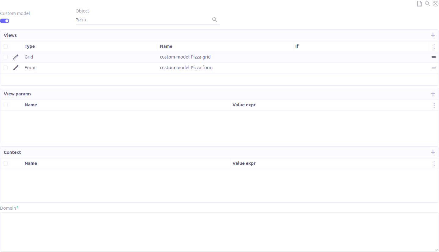
The inline action editor allows you to configure what happens when a user clicks the menu entry:
| Field | Description |
|---|---|
Is JSON |
Toggle between custom (JSON) models and standard models |
Model |
The data model to display when the menu is clicked |
Views (studioActionViews) |
The views to open (grid, form, etc.) with their sequence |
View params |
Additional context parameters passed to the view |
Lines |
Action lines for data manipulation (used with Create/Update actions) |
Domain condition |
A filtering expression to restrict the records shown |
Permissions
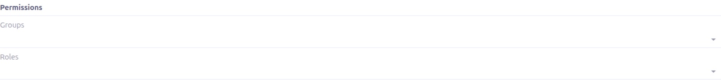
The Permissions panel controls who can see and access the menu entry:
-
Groups (9): Restrict access to members of specific user groups (TagSelect, M2M:Group).
-
Roles (10): Restrict access to users with specific roles (TagSelect, M2M:Role).
|
If neither groups nor roles are specified, the menu is visible to all users. When both are specified, a user must belong to at least one of the specified groups OR have at least one of the specified roles. |
Advanced Options
The Extra panel (collapsible) provides additional configuration:
| Field | Description |
|---|---|
Condition to check |
A Groovy expression evaluated at runtime. The menu is only visible when this expression returns true. Maximum 1024 characters. |
Module to check |
A module name. The menu is only visible when this module is installed. |
Left |
When checked (default: true), the menu appears in the left sidebar navigation. |
Mobile |
When checked, the menu is available in the mobile application. |
Hidden |
When checked, the menu is hidden from the navigation. |
Link |
An external URL. When set, clicking the menu opens this URL instead of an internal view. |
Tag |
Static text displayed as a badge next to the menu title. |
Tag get |
An action-method that dynamically returns the tag value. |
Tag count |
An action-method that dynamically returns a numeric count for the badge. |
Tag style |
Visual style of the tag badge (selection: default, info, success, warning, danger, inverse). |
Technical Details
Studio menus are stored in the StudioMenu entity. When saved, they generate corresponding MetaMenu records that are used by the application’s menu system.
Key relationships:
-
StudioMenu→MetaMenu(generated): The actual menu entry used by the application -
StudioMenu→StudioAction(M2O): The action executed when the menu is clicked -
StudioMenu→MetaMenu(parentMenu): The parent in the menu hierarchy
Related Pages
-
Actions — Configure what happens when a menu is clicked
-
Custom Models — Auto-generated menus for custom models
-
Studio Apps — Packaging menus with other components
-
Configuration — Enable/disable Studio App grouping