Visual View Builder
Overview
The Visual View Builder is the core interface of the Studio module. It is a drag-and-drop form designer that runs directly in the browser, allowing you to create and modify views without writing XML code.
Access the View Builder from App > Studio.
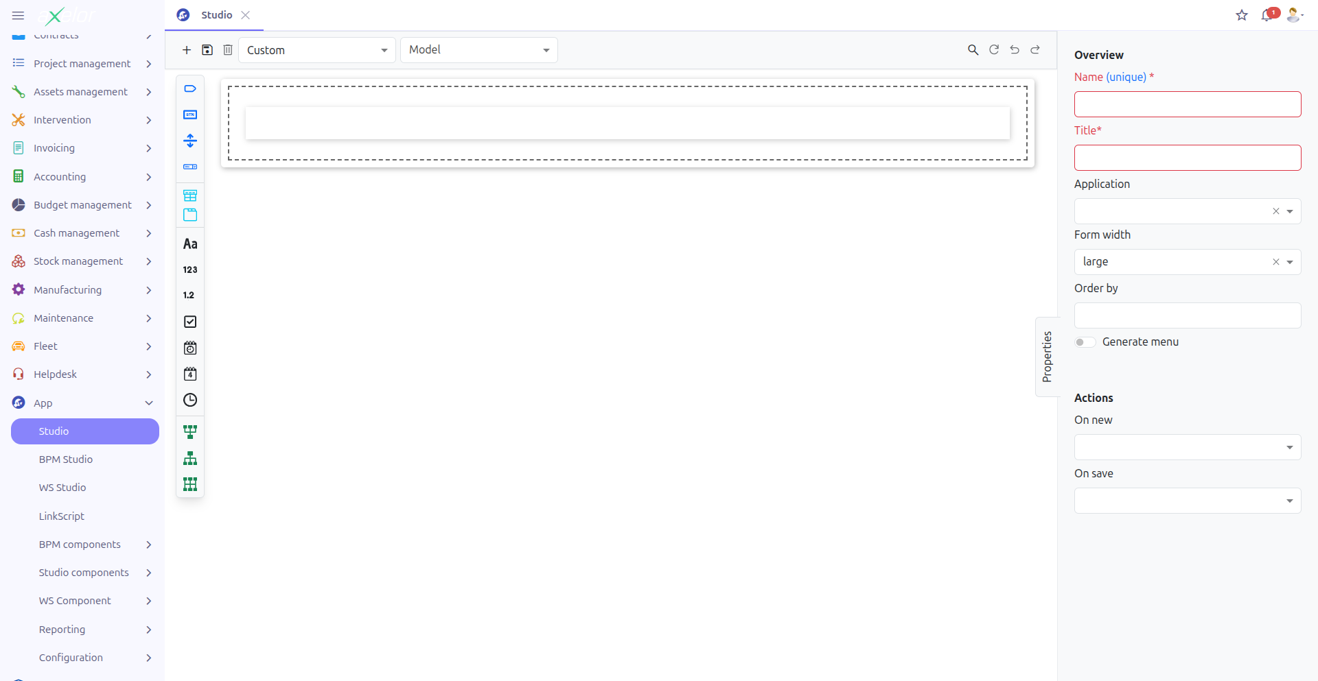
The interface is divided into four areas:
-
Toolbar (1): Action buttons and model/view selectors
-
Widget Palette (2): Draggable field types and panels (left sidebar)
-
Form Canvas (3): The visual representation of your form (center area)
-
Properties Panel (4): Configuration options for the selected element (right sidebar)
Operating Modes
The View Builder operates in two distinct modes, depending on whether you are working with a custom model or an existing standard model.
Custom Model Mode
In this mode, you create entirely new data models (JSON-based) with their own form views. This mode is activated when you select or create a Custom model.
Features available in Custom Model mode:
-
New button — Create a new custom model
-
Delete button — Delete the current custom model
-
Full form design from scratch
-
All widget types available in the palette
|
Custom models are stored as JSON field definitions ( |
View Extension Mode
In this mode, you extend existing application views by adding custom fields and panels. This mode is activated when you select a Standard (non-custom) model and one of its views.
Features available in View Extension mode:
-
Custom fields are added as extensions to the existing view
-
The original view structure is preserved
-
Extensions are generated as XML view extensions with XPath expressions
|
In View Extension mode, you cannot delete the base model or the original view elements. You can only add new custom fields and panels. |
Toolbar

The toolbar provides the following controls:
Model and View Selection
-
Model selector (1): Choose the model to work with. Toggle between Custom and Standard models.
-
View selector (2): Select which view of the model to edit (when multiple views exist).
-
Custom field selector (3): In View Extension mode, filter to show only custom fields.
Action Buttons
| Button | Description |
|---|---|
New |
Create a new custom model. Only available in Custom Model mode. |
Save (Ctrl+S) |
Save the current form design. The button indicates unsaved changes (dirty state). |
Delete |
Delete the current custom model and its associated view. Only available in Custom Model mode. |
Search (Ctrl+F) |
Search for fields and elements within the current form design. |
Refresh |
Reload the current form design from the server. |
Undo |
Undo the last modification to the form design. |
Redo |
Redo a previously undone modification. |
| The Delete action permanently removes the custom model and all its fields. This operation cannot be undone. |
Widget Palette

The widget palette on the left side provides draggable elements that you can drop onto the form canvas. Widgets are organized into categories:
Common Widgets
| Widget | Description |
|---|---|
Label |
Static text display element |
Button |
Clickable button that can trigger actions |
Separator |
Visual separator line between form sections |
Selection |
Dropdown selection field using a predefined selection list |
Panel Widgets
| Widget | Description |
|---|---|
Panel |
Container for grouping related fields together |
Panel Tabs |
Tabbed container for organizing fields into multiple tabs |
Field Widgets
| Widget | Data Type |
|---|---|
String |
Text field (single line or multiline) |
Integer |
Whole number field |
Decimal |
Decimal number field with configurable precision |
Boolean |
Checkbox (true/false) |
DateTime |
Combined date and time picker |
Date |
Date picker |
Time |
Time picker |
Relational Field Widgets
| Widget | Description |
|---|---|
Many-to-One (M2O) |
Reference to a single record of another model |
One-to-Many (O2M) |
List of related records from another model |
Many-to-Many (M2M) |
Multiple references to records of another model |
|
The One-to-Many (O2M) widget is not available in StudioLite mode (embedded/restricted version of the View Builder). |
Properties Panel
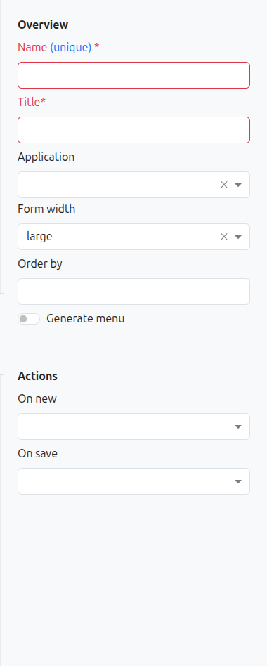
When you select a field or panel on the form canvas, the Properties Panel on the right displays its configurable attributes.
Common properties include:
-
Name: Technical name of the field
-
Title: Display label shown to users
-
Type: Data type of the field
-
Widget: Visual widget used for rendering (e.g., Email, URL, Password for string fields)
-
Help: Tooltip text displayed on hover
-
Default value: Value pre-filled when creating a new record
-
Required: Whether the field must be filled
-
Read-only: Whether the field is non-editable
-
Hidden: Whether the field is hidden from the view
-
Show if / Hide if: Conditional expressions controlling visibility
-
Required if / Read-only if: Conditional expressions controlling behavior
See Custom Fields for a complete reference of field types and their specific properties.
Drag and Drop
To add a widget to your form:
-
Select a widget from the Widget Palette on the left
-
Drag it onto the Form Canvas in the center
-
Drop it at the desired position (a visual indicator shows where the widget will be placed)
-
Configure the widget using the Properties Panel on the right
You can also reorder existing fields by dragging them to a new position within the form.
Undo / Redo
The View Builder maintains a full history of your modifications during the current editing session. Use the Undo and Redo buttons in the toolbar (or keyboard shortcuts) to navigate through your change history.
The dirty state indicator on the Save button shows when you have unsaved changes. If you try to close the browser tab with unsaved modifications, a confirmation dialog will prompt you before leaving.
StudioLite Mode
StudioLite is a restricted version of the View Builder designed for embedded use within other contexts (such as the BPM modeler). It provides a simplified interface with:
-
Fewer widget types available (notably, One-to-Many fields are hidden)
-
No model/view selector in the toolbar
-
Streamlined for quick field additions
StudioLite is activated via the isStudioLite URL parameter (see URL Parameters below).
URL Parameters
The View Builder accepts the following URL parameters to control its initial state:
| Parameter | Description | Example |
|---|---|---|
|
Model type to load ( |
|
|
ID of the model to open |
|
|
ID of the view to edit |
|
|
ID of a custom field to focus on |
|
|
Activates StudioLite mode (restricted interface) |
|
|
Title of the model (display purposes) |
|
| These parameters are typically set automatically when opening the View Builder from other contexts (e.g., clicking Open in Studio on a form view, or opening from the BPM modeler). |
Theme Support
The View Builder automatically detects and adapts to the application’s theme settings, including dark mode. The interface renders correctly in both light and dark themes.
Related Pages
-
Custom Models — Creating and managing custom data models
-
Custom Fields — Field types, widgets, and validation
-
Conditional Expressions — Show if, hide if, required if syntax
-
Studio Overview — Complete feature overview